
Extend widgets available in shiny
This package offers custom widgets and other components to enhance your shiny applications.
You can replace classical checkboxes with switch button, add colors to radio buttons and checkbox group, use buttons as radio or checkboxes. Each widget has an update method to change the value of an input from the server.
Installation :
# From CRAN
install.packages("shinyWidgets")

# From Github
# install.packages("devtools")
devtools::install_github("dreamRs/shinyWidgets")
Demo :
A live version is available here : http://shinyapps.dreamrs.fr/shinyWidgets
Turn checkboxes into toggle switches :
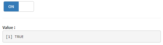
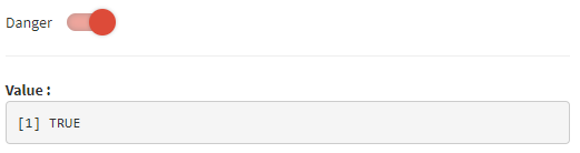
Turn checkboxes into toggle switches (again) :
Checkbox and radio buttons with the beautiful CSS library pretty-checkbox : 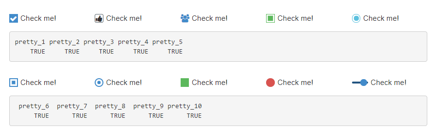
prettyCheckbox(
  inputId = "pretty_1", label = "Check me!", icon = icon("check")
),
prettyCheckbox(
  inputId = "pretty_2", label = "Check me!", icon = icon("thumbs-up"),
  status = "default", shape = "curve", animation = "pulse"
),
prettyCheckbox(
  inputId = "pretty_3", label = "Check me!", icon = icon("users"),
  animation = "pulse", plain = TRUE, outline = TRUE
),
prettyCheckbox(
  inputId = "pretty_4", label = "Check me!",
  status = "success", outline = TRUE
),
prettyCheckbox(
  inputId = "pretty_5", label = "Check me!",
  shape = "round", outline = TRUE, status = "info"
),

...Displays a message to the user :

See examples in ?sendSweetAlert.
Request confirmation from the user :
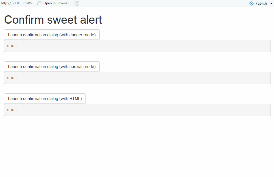
See examples in ?confirmSweetAlert.
Slider with strings, to pass whatever you want :
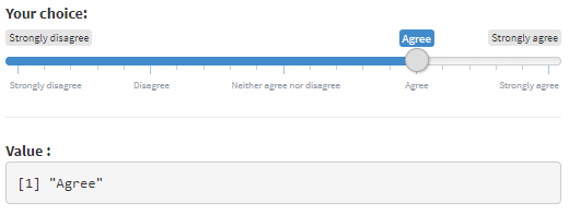
sliderTextInput(
  inputId = "mySliderText",
  label = "Your choice:",
  grid = TRUE,
  force_edges = TRUE,
  choices = c("Strongly disagree",
              "Disagree", "Neither agree nor disagree",
              "Agree", "Strongly agree")
)A jQuery based knob, similar to sliderInput or sliderTextInput:
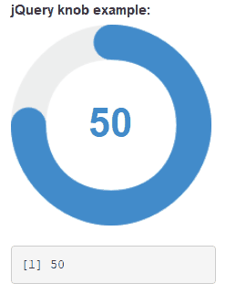
knobInput(
  inputId = "myKnob",
  label = "jQuery knob example:",
  value = 0,
  min = -100,
  displayPrevious = TRUE,
  lineCap = "round",
  fgColor = "#428BCA",
  inputColor = "#428BCA"
)Dropdown menu with a lot of options :
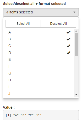
pickerInput(
  inputId = "myPicker",
  label = "Select/deselect all + format selected",
  choices = LETTERS,
  options = list(
    `actions-box` = TRUE,
    size = 10,
    `selected-text-format` = "count > 3"
  ),
  multiple = TRUE
)Turn buttons into checkbox or radio :

checkboxGroupButtons(
  inputId = "somevalue", label = "Make a choice :",
  choices = c("Choice A", "Choice B", " Choice C", "Choice D"),
  justified = TRUE, status = "primary",
  checkIcon = list(yes = icon("ok", lib = "glyphicon"), no = icon("remove", lib = "glyphicon"))
)A text input only triggered by hitting ‘Enter’ or clicking search button :
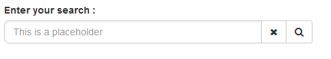
searchInput(
  inputId = "id",
  label = "Enter your search :",
  placeholder = "This is a placeholder",
  btnSearch = icon("search"),
  btnReset = icon("remove"),
  width = "100%"
)Hide input in a button :
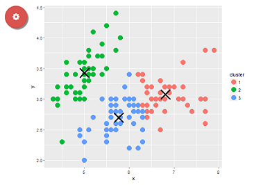
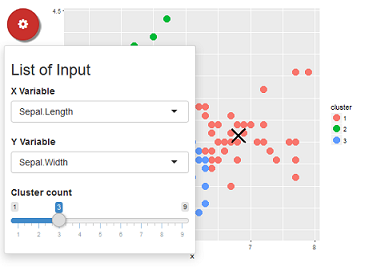
dropdownButton(
  tags$h3("List of Input"),
  selectInput(inputId = 'xcol', label = 'X Variable', choices = names(iris)),
  selectInput(inputId = 'ycol', label = 'Y Variable', choices = names(iris), selected = names(iris)[[2]]),
  sliderInput(inputId = 'clusters', label = 'Cluster count', value = 3, min = 1, max = 9),
  circle = TRUE, status = "danger", icon = icon("cog"), width = "300px",
  tooltip = tooltipOptions(title = "Click to see inputs !")
)
And others !