
![]()
![]()

A library for creating time-based charts, like Gantt or timelines. Possible outputs include ggplots, plotly graphs, Highcharts or data.frames. Results can be used in the RStudio viewer pane, in R Markdown documents or in Shiny apps. In the interactive outputs created by vistime() and hc_vistime() you can interact with the plot using mouse hover or zoom. Timelines and their components can afterwards be manipulated using ggplot::theme(), plotly_build() or hc_*functions (for gg_vistime(), vistime() or hc_vistime(), respectively). When choosing the data.frame output, you can use your own plotting engine for visualizing the graph.
If you find vistime useful, please consider supporting its development: 
Feedback welcome: sa.ra.online@posteo.de
To install the package from CRAN, type the following in your R console:
install.packages("vistime")This package vistime provides four main functions, the first three allow you to draw a timeline with Plotly, Highcharts or ggplot2, the last one outputs the pure optimized data frame ready for plotting.
Plotly chartstimeline_data <- data.frame(event = c("Event 1", "Event 2"),
start = c("2020-06-06", "2020-10-01"),
end = c("2020-10-01", "2020-12-31"),
group = "My Events")
vistime(timeline_data)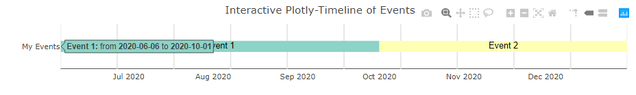
Highcharts timelinestimeline_data <- data.frame(event = c("Event 1", "Event 2"),
start = c("2020-06-06", "2020-10-01"),
end = c("2020-10-01", "2020-12-31"),
group = "My Events")
hc_vistime(timeline_data)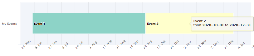
This is facilitated by the highcharter package, so, this package needs to be installed before attempting to produce any hc_vistime() output.
ggplot2 outputtimeline_data <- data.frame(event = c("Event 1", "Event 2"),
start = c("2020-06-06", "2020-10-01"),
end = c("2020-10-01", "2020-12-31"),
group = "My Events")
gg_vistime(timeline_data)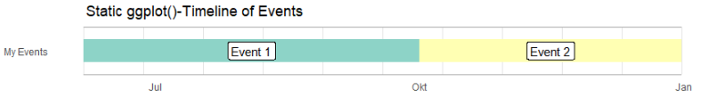
data.frame output if you want to draw yourselftimeline_data <- data.frame(event = c("Event 1", "Event 2"),
start = c("2020-06-06", "2020-10-01"),
end = c("2020-10-01", "2020-12-31"),
group = "My Events")
vistime_data(timeline_data)
#> event start end group tooltip col subplot y
#> 1 Event 1 2020-06-06 2020-10-01 My Events from <b>2020-06-06</b> to <b>2020-10-01</b> #8DD3C7 1 1
#> 2 Event 2 2020-10-01 2020-12-31 My Events from <b>2020-10-01</b> to <b>2020-12-31</b> #FFFFB3 1 1You want to use this for the intelligent y-axis assignment depending on overlapping of events (this can be disabled with optimize_y = FALSE).
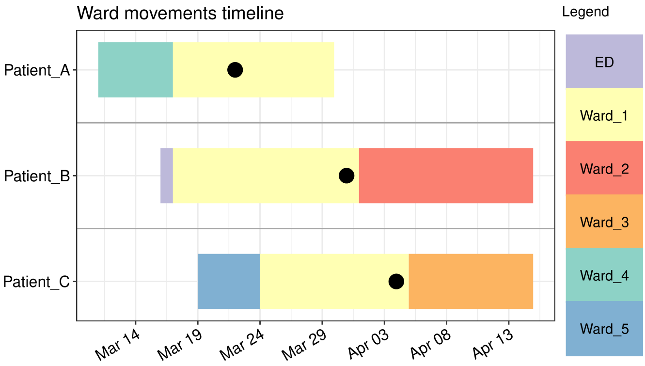
During COVID-19 2020, [@wlhamilton](https://github.com/wlhamilton) used gg_vistime() for visualizing patient ward movements as timelines in order to investigate possible hospital acquired infections. See his github for the code.
There is a vignette for each of the three functions of the package where they are explained in detail:
vistime() for interactive Plotly output: Link to manualgg_vistime() for static ggplot2 output: Link to manualhc_vistime() for interactive Highcharts output: Link to manual